Design
Inspiration
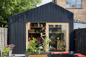
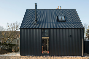
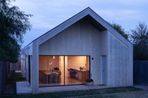
Some inspiration came from garden rooms and homes such as Richard John Andrews’ Light Shed, the Corrugated Metal Extension by Eastabrook Architects and Project Felix by Leÿer.
The Design
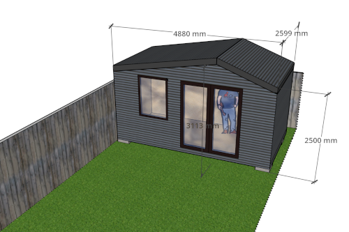
OK, OK. It’s not the best looking render, but you get the idea.
For the floorplan and position of the shed:
- I wanted a shed that was big enough to be a workshop or occasional home office. My garden is approximately 5 m wide, and it made sense to make the shed take up the full width of the garden.
- I left just enough room (about 30 cm) for me to fit down the right hand side, as I cannot remove that fence panel. To the left and rear of the shed, I knew I would be able to remove fence panels for access so went as close to those boundaries as I could.
- The depth was limited by the roots of the maple tree (not shown), which we didn’t want to damage.
- I limited myself to a floor area of 15 m² or fewer to avoid building regulations.
For the front elevation:
- I needed to fit in a door and a window.
- I wanted to avoid having a single wide door take up the majority of the front wall. I don’t have any objection to wide bifolds in general but, in my case, they would have limited the wall space and didn’t provide enough privacy.
The final requirements were:
- To have enough headroom, at some spot, so that I could reach up without touching the ceiling (handy for exercises).
- To avoid having to trim too many branches from the maple tree.
- To accommodate walls and a roof at least 150 mm thick for thermal performance. See more on this in the Misc→Thermal Efficiency and Comfort section.
Modifying the Design
A disclaimer: the initial design for &shed was done by a family member of mine, who is an architect. Consider that cheating, if you will. However, I did have to make a number of small adjustments. When making these changes, I tried to keep the following constraints in mind:
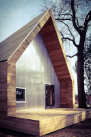
- The peak of the roof aligns with the centre of the door so that the placement looks deliberate. This did result in some awkward roof angles (approx. 12 degrees and 22 degrees).
- The windowsill should be high enough that the window, when swung open (mine opens inwards), doesn’t hit the desk/workbench.
- The top of the window should align with the top of the door, so that it looks coherent.
- Practically, there must be enough space above the window to accommodate the thickness of the roof plus the thickness of the window lintel.
- The ceiling height at the far ends shouldn’t be much less than 2 m so as not to feel uncomfortably low.
Give me a shout if you would like a copy of the SketchUp file.
Thoughts
It was invaluable to have an architect who is used to thinking about proportion, light, symmetry and how spaces are used to be part of the design process.
Player of the Match
SketchUp. It’s worth learning one 3-D modelling package well and SketchUp has a free tier and is easy to use. I nearly bought the premium version, I used it that often during the build.
What I’d do Differently
I would consider adding a small overhang around the front of the building, like the one seen on the Westonbirt Mess Building, above. It wouldn’t quite work for me, without heavy tree pruning, but it would have given the door and window a little protection from the elements.
